Over the weekend I had a chance to participate in a closed beta stress test of Lord of the Rings Online (Turbine). As a result, I feel the need to share my feelings regarding not just this game, but The Lord of the Rings in general. It may come as a surprise that I am trying out an MMORPG again, especially after my somewhat strong thoughts in opposition to WoW. This game, Lord of the Rings Online, is different for me though.
When I first came to the US so many years ago now, and began learning English, the first book I read in my, at the time, new language was The Hobbit. It took me forever to get through it with my dictionary, having to look up so many words I did not understand. The fact that Tolkien's writing style is old made it that much more difficult.
Still, I fell in love with the characters and the world. Shortly thereafter I started reading The Lord of the Rings, and with less difficulty. It still took me a long time to get through the first book, but the second and third were much easier.
I suppose you might say that it grew into somewhat of an obsession for me, dreaming at night of running through the forests of my former homeland as an elf. This was another badge of nerdhood I have carried on my chest. I was fascinated by Middle-earth long before it become cool on account of Peter Jackson.
Before the MMORPG games that we now know, Middle-earth beckoned me to join the fight online in a different way. What must have been my first online gaming experience, my heeding the call of Middle-earth, was a MUD called MUME. I confess I didn't last long. I played for a few months, and managed to gain a few levels, but the high difficulty and steep learning curve got the better of me. MUDs are not for the faint of heart to be sure, and that was one nerd badge I would not win. All the same, my brief excursion into MUME was very enjoyable. What I enjoyed the most perhaps was the realism of my character's mortality in the form of being weak and having to eat and drink lest he die of hunger or thirst (something you never see in games anymore).
The chance to exist in Middle-earth, however, was the biggest reward. The role-playing was nice, and I must say that from current experience people don't seem to role-play much anymore even on dedicated RP servers. This brings me to my most recent experience of Lord of the Rings Online. I tried all available character races, starting out as an elf. I always play an elf. I made up my mind, long ago during one of those nights, that I was an elf actually. Somehow that stuck, and I have maintained this illusion for many years. Yet for some reason I was not thrilled with being an elf anymore, and maybe it's all thanks to the movie's interpretation of Legolas. Just maybe it took the fun out of being an elf for me.
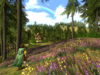
And so, I found myself sticking with the Hobbit. An uncharacteristic choice perhaps, but playing a Hobbit burglar was much more enjoyable to me. I spend a couple of days running around the Shire, meeting various shire folk. Some familiar names even, which was always a pleasure, even when it was Lobelia Sackville-Baggins.
My brief foray back into Middle-earth reminded me of all the things I cherished about this universe that Tolkien has created for us. Even if Lord of the Rings Online is quite similar in mechanics to other MMORPG games, the fact that it takes Tolkien's writings to heart in creating an accurate representation of Middle Earth pleases me. Being able to experience this universe yet again intrigues me. Thus I may actually venture forth unto Middle Earth once more when the game becomes publicly available.
Once More I Venture Unto Middle-earth
Brave Battling Barista Nookoo Nookoo...
Once more, I go into the loop of the everyday and happily employed average shmuck. I do hope that my new job will be a good one, and that it will be something I can do until Michal and I move to Plan B: Travelocity. Once I complete training, I will be a un grande Barista, at least as much as an American chickie can be. Woohoo. This may have consequences that I cannot begin to foresee, e.i. an extreme addiction to caffeine, lactose intolerance, and some other lovely things that involve my digestive system, but what the hell... Now I know how to foam milk, and some other stuff too! Hehehe. On one hand, I have never worked as a waitress or in a kitchen before, and I am nervous...on the other hand, I'm looking forward to learning new things.
It's Raining In My Cranium...

I can't believe it's been two weeks since my last post. That's not good. I guess I've been in a bit of a funk. A job related funk and a personal funk. I haven't felt like doing anything online, neglecting my blog and watching my Minitokyo notifications pile up. I'm sorry folks, as you, my loyal readers, have suffered in this. Oh wait, what readers?!? Ha ha...never mind.
Truth be told, when I feel down I take refuge in my games. I finished Cave Story over a week ago, and have begun replaying it to get to the secret stage and the third, and better, ending. However, not too long ago a dear friend of mine sent me a copy of Okami. A belated Christmas gift, but a very welcome one to be sure. So thank you for that!
Since then, I have been enamored with Okami and have been playing it quite a lot. Though when I first popped it into my PS2, my old system decided it was going on hiatus. I tried other discs, and as it turns out it had stopped recognizing almost all media. This did not make me happy. It got me down even more, but I was also pretty upset. I blamed Sony, and myself for not getting in on the massive free repair service they offered at one point.
My PS2 had been very bad, and it was time for it to get a spanking. I opened it up, and played around with "the white wheel of life and death." Eventually I got it to recognizing all my discs again and all was well. I was clear to spend many hours on Okami, and I sure have. How much more could I ask from a game? It has beautiful art, originality, wonderful music, it's saturated with Japanese folklore, and the story is wonderful and engaging to boot. I even managed to find the high resolution versions of the Okami walls, thanks to BBPS!
I'm still in the middle of it, and it has helped me to get through this emotional trough of mine. Playing Okami has actually rekindled my desire to play Zelda: Wind Waker, which I never have yet. And seeing as how it's nice and cheap now, I just might pick up a copy of that, instead of the newer and more expensive Twilight Princess. But that's still in the future, and Okami is what I am going to persevere with at present.
More importantly, Okami makes me feel better. It also makes me feel better about video games, thinking that there may be hope for the industry after all. I imagine that with the game's help, I'll be getting back to my regular post-happy self soon. I'll need to put a dent in those Minitokyo notifications too.
Claims of an Unidentified Deceased Project

While at Odiyan in CA, I created a couple of pages for a graphic novel idea. They were used in a proposal for a larger work. Unfortunately things basically ended with that. Since the organization was non-profit, they were not receptive to the idea of any compensation for the work other than what I was already receiving.

In any case, the first image above was the concept drawing for the setting of the story's beginning. Then you have the next page, which shows the initial characters, albeit briefly. Now, since these pages were created in manga style, you read them from upper right to lower left, though you don't have to worry about that on the first page.

This is the second page, where the cell order is more important. It introduces another character, and establishes the basis of their relationship. I have considered continuing this story on my own, though I would have to obtain the book which contains the short stories that serve as the inspiration for it. Not that this would be difficult, but I wonder if I have the motivation and desire to undertake such a task.
Still, it might be fun just to make a shortened version and do better quality inked pages of this. We'll see.
We're Just Another Spectacle of Selves

Big thanks to the folks over at Anti Patterns for putting up my Mentis Game Awards for Storytelling on their site. My French is nearly non-existent so I've had to use Google's translation to figure out the gist of the comments about the post. I posted a thank you there as well, but I haven't seen it go through moderation just yet.
In other news, we went to the Friday Nite Cucalorus (annual fest info here) and had a very nice time indeed. It was our first time at the weekly even which takes place at the Independent Art Company's micro cinema. Our viewing included the 60 minute film Poverty Outlaw. It struck somewhat close to home with me, as the film portrayed women and their children in Philadelphia who had been forced out of jobs due to downsizing and ended up on the streets. Meanwhile the local government authorities cracked down on them for taking refuge in abandoned buildings, cut their wellfare benefits, and took away their children.
This is something that happens all over this country. I know, I've been there. It happens all over this world. After the film I was reflecting upon my own history, especially before we came to The States. We had done our share of running from refugee camp to refugee camp in Europe. We had been deported from more than one country there, and stowed away past armed soldiers. But that's a story meant for a book. And maybe someday I'll have the courage to write it.
In the meantime, I'm looking at the prospect of having a show at the Independent Art Company. Might possibly combine it with a Friday Nite Cucalorus of anime. Rest assured, I'll be broadcasting it loudly when and if it happens.
Holding Employers Accountable

For several months now I have been wishing that there would be a website out there just like ResellerRatings.com, but for employers. I've had more than one unpleasant job, and I'm sure that mostly everyone else has too. Employers want to call references, do background checks, drugs screens, and sometimes even create blacklists. But what can an employee, being only one person, do? Where are the references of the company we are applying to work for?
Naturally any savvy individual can do some research online and elsewhere to be more informed about who they're going to work for. That doesn't mean that there should not be an easier way. If employees are to be held accountable, then so should employers. Dishonest and corrupt companies who treat their workers like trash should not be rewarded with an endless supply of an uninformed workforce.
A few days ago I managed to find a website which can help us even the playing field a little. I speak of JobVent.com my friends, founded by someone very much like you and me. The FAQ reads "I'm just a guy who was unhappy with his job. I quit and started my own company which developed this website."
Here's to you Mr. JobVent Guy, and thank you for allowing us to share this information. I took the liberty of posting reviews of three of my previous jobs thus far. Two of which were negative and one which was positive. I encourage everyone to submit as many of their employers as possible, in order to help this repository of information to grow. Also, please add your Digg to spread the word.
Power to the people! Workers unite! Solidarność! ...what can I say, I'm Polish.
Curly Brace: My First Vector

It's funny how I have been using Photoshop for five or six years, and I think I'm pretty good with it, and yet there are some parts of the program that still elude me. Some of the features still seem quite complex, and so I just kind of forget about them and end up ignoring them. Not realizing what it is that I'm missing out on.
So too it was with the Pen Tool. But no more I say! I was looking at a Minitokyo affiliate site called Imanimetions, and noticed that they have an excellent tutorial section which just happened to contain a great little Pen Tool tutorial. Finally, this tool was no longer a mystery to me. This tutorial presents the Pen Tool in a straightforward manner and teaches you how to use it effectively in no time.
Armed with this new knowledge, I was able to begin doing vectors—the oh so popular way to render images, especially in anime/manga. I figured I would start off doing my first vector piece with something simple. A perfect subject for my experiment would be a little character portrait of Curly Brace from Cave Story, a.k.a. Doukutsu Monogatari. I love this little image and have been meaning to do something with it for a long time.
I didn't take me all that long, and I put it up on Minitokyo after I finished. I have also made the wall available above (just click on the image for full view). Hope you like Curly as much as I do.
Eventually I'll do some more complex vectors now that I have a handle on it. Until then, enjoy Curly Brace, and go get yourself Cave Story to experience the awesomeness that it is!
Guide to Creative Painting (Manga Version)
Some time ago I taught a painting workshop at the Yellowstone Art Museum using certain techniques to promote creativity and allow for a more "loose" rendering of the resulting image. The style is oriented towards an abstract expressionistic approach, but can be adjusted to fit other styles as well. I think it would be most beneficial if this lesson is made available to anyone who wishes to give it a try.
Moreover, this guide is intended for all levels of experience. If you have no experience in art you will hopefully find this just as beneficial and easy to follow as those who are more seasoned. Perhaps my most important recommendation is for you to set aside all of your preconceived ideas and knowledge of art. Doing so, as much as is possible, will make this experience more fulfilling than it would be otherwise.
Reference and Materials
The following materials are needed in order to proceed:
- charcoal or marker
- paper for drawing
- paint (acrylics are used in this guide)
- prepared painting surface (canvas, masonite, wood, etc.)
- brushes (including a long bristled liner brush)
I am using the above image as my reference, which was scanned from a Tokyopop sampler. The scan is from the manga Baby Birth by Haruhiko Mikimoto, and depicts the character Hizuru Oborozuki (Figure A).
Drawing Without Controlling
The first exercise involves creating some sketches of your reference object. However, if these were regular sketches, not only would that exclude many people from being able to perform this exercise, but it would also lack the desired effect. The sketches we'll be doing are referred to commonly as "blind drawings."
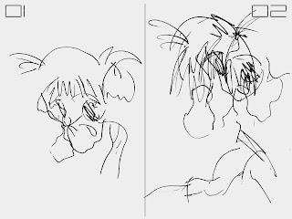
Here is an illustration of the difference between a loose sketch of the reference image (Figure B.02), and a blind sketch of that same image (Figure B.01). The idea of the blind drawing is to create it without looking down at your hand and the paper. You must not look down at your sketch until it is completed, keeping your reference in focus the whole time.
This may feel quite strange and uncomfortable at first, especially if you have never done this before. The reason is because you have very little control over the outcome of your drawing, which is exactly the intention of this exercise. By eliminating your perception of the creative process, it is also freed from what your mind would impose upon it. The mind often enforces its own rules upon what it perceives, and that is also why the drawing would loose some of its unhindered quality. In order to proceed, however, we need such an unhindered drawing.
I have three such blind drawings of Hizuru, each slightly different (Figure A and B). Yet they all share the same barely intelligible style. Feel free to create as many of these blind drawings as you wish, and go on to the next step when ready.
Since that next step involves moving into the painting portion of the process, this is a good time to prepare your space and materials. We need to choose one of our blind drawings and use it as the basis for our painting. Choose any of the drawings that you have created, but be aware that the end result of this exercise will not necessarily resemble that image.
Painting a Non-objective Foundation
Pick any color of paint to create a painted "sketch" of the blind drawing you have chosen on your prepared surface. Essentially, you can try to copy the drawing onto your canvas with the brush (Figure D.01). If you like, you may even try the "blind painting" method to further abstract the image on your canvas. This would function just as the blind drawing technique did earlier.
At this point, what is on your canvas is likely to look very abstract. This is where you begin to focus on the shapes and lines that you see, ignoring any possible "objects" you may wish to perceive. This in turn makes this part of the painting process "non-objective."
Following the example above (Figure D.02 and D.03), choose a color and begin to fill in some of the shapes that you see in your painting. Repeat this process again with a different color to until you have covered as much area as you wish. Keeping the paint diluted with water or medium allows you to see the underlying image of the initial line painting.
Next I would recommend choosing a new color and filling in the edges of your piece, which creates a sort of background. I am choosing a lighter blue to fill in around my piece composed of green and brown (Figure E.01). Let your painting dry after this step, in preparation for the next technique.
In order to create more depth, we are using a layering process not dissimilar from that used in digital image editing software. Your next color choice should be different from your previous choices. Keeping the paint slightly thinned, apply your new color around what could be the negative space in your image. Distinguishing between positive and negative in this case is very subjective due to the abstract nature of your painting.
You can see I am masking some of the elements previously visible (Figure E.02). Yet the slightly transparent nature of this new layer of paint allows you to see some of the image underneath it.
Let your painting dry again, and choose a new color once more. This time make your paint consistency very thin, in order to apply more of a glaze than a coat of paint. Use this mixture to coat the entire painting. I use blue to tint the painting with a blue hue (Figure E.03).
For the next section the painting needs to dry yet again. We will be changing direction also from our non-objective foundation. This is a good time to take a break in the process and reflect on the current image that you have created.
Painting an Objective Result
I recommend stepping back away from your painting at any time throughout the process to get a different perspective, but especially now. Look at what shapes you have created, and see if they remind of you anything. From here on out we will try to create an objective image from the abstract shapes that are contained on the canvas.
However, this is not entirely necessary. If you desire to rather create an abstract painting, simply continue with abstract shapes instead of the objective suggestions I am putting forth. Either direction is compatible with this guide.
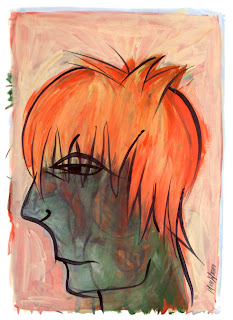
My piece, partially due to being manga inspired, continues in that vein. I see the potential for a portrait style image. The combination of the shapes in my piece seem to suggest a profile view of a face. Deciding to continue with this imagery, you will notice that I am taking steps to achieve this (Figure F). So too, you may see shapes in your painting that remind you of an object. Focus on this and try to work towards shaping the painting into the object of your choosing.
My first decision towards this goal is layering more warm colors for the hair of my portrait (Figure F.02). These layers, using thinner paint, continue to generate depth in our piece and I would suggest continuing with this technique. Once satisfied with my new layers, I am choosing a lighter color than the background color already present to define my new shape.
Since the edges of your painting may not entirely match the object of your choice, I would recommend doing the same. Choose a color that is lighter than your background, and paint over the existing layers to define the shape of your object. It is not necessary to completely cover the underlying painting, because we are still trying to use the layering technique here.
Using a light color on a darker background serves two purposes. First, by allowing the underlying color to come through partially, we continue to add depth as with our other layers. Second, it creates richer lighting and texture. Be advised, however, that you may need to use additional paint for proper coverage. It is more difficult to lighten a surface than it is to darken it.
As we get into the final phases of this painting, I use thicker mixtures of color to actually cover up some of the work that was done earlier (Figure G). I use more light and warm tones to shape the hair of my portrait (Figure G.01), and a darker green wash to create a more uniform color of the face by negating that vibrant area of red (Figure G.02).
Some of this may seem strange in light of the care taken to create all the previous layers of the painting. You may choose to accentuate your previous steps by keeping your new paint layers thin enough to keep them more transparent. In my process I do so to varying degrees, and I feel that even if the colors and shapes don't always come through, the texture is richer than if I simply used one or two layers of flat color. Besides, I do not cover all of my previous layers in this case, thus retaining some of that transparency.
After my shapes have been defined I used one of my lighter colors, though not white, to give the piece a final wash (Figure G.03). Doing so lightens the whole painting, thereby softening some of the edges and high contrast areas. This is important because I wanted the face to be more intelligible, and it also prepares the image for my final techniques. If your piece is too dark, you may want to do multiple lighter washes, but remember to let the paint dry in between coats. If your painting is too light, then simply do a darker color wash, and don't be afraid to experiment.
The final techniques included in this guide are as follows. I want my character's hair to have a stronger tint of red, because I feel that it would provide a good contrast to his darker skin tone. I use an orange mix to shape his hair, giving it a little more volume, and of course those red highlights (Figure H.01). Similarly, you can choose a new color, possibly a contrasting one, to add a few final details that you may feel are missing.
The painting needs to be dry for the final touch. In the meantime, I suggest creating the paint mix that we will be using. The technique calls for a black, lower viscosity paint mix. I use parts of both water and acrylic medium with my black paint in order to achieve my desired thickness, which is only slightly thinner than that of latex house paint. You want the paint to flow easily off the brush.
The brush choice is also important for this step. I use a thin, long bristled liner brush, and that is just about ideal. The best brush for this purpose would be a round brush, between one to two inches in length (2-5 cm), and one eighth of an inch (3 mm) or less in width. Other brushes may be used as well, but it is more difficult to accomplish this step without the right type of brush.
The idea is to create contour lines with the black paint for a more graphic look. This is of course a stylistic choice that is particular to my own work, which you are free to modify or forgo entirely. However, if you do choose to add them, I think you will be pleased with the effect. It's important not to be too tight with your brush strokes when painting these lines. It is also important to know that the lines need not match up exactly with your image, nor should they. Almost like a print with misaligned registration, the natural and free-form look of the black lines is a stylistic choice that I am very fond of (Figure H.02).
This is the final version of the painting (Figure I). Naturally your painting will look quite different, unless of course you emulated my own steps in this guide exactly. Though I hope that you were able to open up your creative vault and find a method to bring forth its contents. My intention was to provide you with a guide that would not be difficult to follow, regardless of your skill level.
So on that note, I'd be glad to hear of your thoughts and suggestions about this article. Especially if you have followed the tutorial, I would be glad to hear of your experience. I would be even more glad to see your experience.
If you like this article, feel free to add your Digg and spread the word.
A Pekingese Christmas Mod
The holiday season is a time to sprinkle fairy dust in your loved one's eyes, and to give thoughtful gifts, correct? While the retail holiday season was in full swing, I avoided stores, since places like that require something called money (or credit). My Polish family didn't receive many gifts from me this year, but I'd like to think the few things I did give were very thoughtful and sweet...though relatively inexpensive & time-consuming. For my delicious hubby, I got a tiny itty bitty SD card, 2 gigs worth. It never ceases to amaze me how much the tiniest gadgets cost, but considering how much memory his beloved Zodiac has after that upgrade, I think he likes it a lot. Gift certificates are good for those tricky people who ya know just have particular tastes. I didn't really get anything specifically for my sister-in-law or her boyfriend, seeing as they were getting a refurbished computer. Oo la la.
Getting a gift for your mother-in-law is a hair-raising experience. It didn't help that she specifically expressed no desire to get anything in particular this year. But you know that there's always something that she would like...
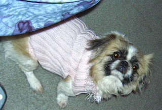
...Anyways, a trip to Walmart Hades for some pink knitting worsted, $2.19, some trim, $3.59, and a pair of needles, $1.59. And so, for a total of $7.37 and several hours of labor on my part, I made this scrumptious Pekingese Anti-Nudity Device. Puchiguso!!!
New Year's Eve In Wilmington: Nothing Happened

Last night for New Year's Eve, Nikki and I had hoped to keep things low key. At about 11:30 we headed on down to the river downtown. Wading through the drunken crowds that poured out of every bar and nightclub, we admired the attractive people of the night. Chances are they didn't look quite as good this morning.
Along with other onlookers gathering at the river walk, we found ourselves a bench and sat together awaiting the new year. At the stroke of mignight, cheers went through the crowds and the various establishments around us, and before us from across the river shot up invisible fireworks of nothingness!
That's right folks. The City of Wilmington completely dropped the ball this year, and I'm not talking about the twinkling one for New Year's. No fireworks. Not anything other than the jubilations of drunken party-goers. We kissed, and let out sighs of disappointment. C'est la vie, mon amis.


