Based on the short talk I gave at the Anime & Manga Art Workshop at the Taubman Museum of Art in Roanoke, Virginia. This is a cursory treatment of anime and manga, it's historical and cultural background, and the art movement that has resulted therefrom.
0. Introduction
Some might find it strange that a Polish artist, living in America, is making art based on Japanese culture. Because I grew up living in many different countries, and have this multicultural background, I look at the world in a multinational way. I see the flow of media across continents, and my work is based on my observations from that very multicultural perspective.
Culture is integral to any art that is created, and so too with anime and manga there is a lot of history and cultural context that has shaped it over the years.
 1. Ukiyo-e
The Japanese art form of Ukiyo-e, which began around 1620, essentially laid the groundwork for a Japanese sensibility in art that would later find its way into manga, and then anime. This form of painting which started some 400 years ago had already established the use of flat colors and black contour lines.
 2. Hiroshima & Nagasaki
In 1945, atomic bombs were dropped on Hiroshima and Nagasaki, forever altering the nation of Japan and its people. The motif of the atomic bomb and destruction on a massive scale would come back in anime and manga again and again, and continues to resurface to this day.
 3. Westernization
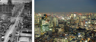
Having lost the war, Japan starts out on a rapid process of rebuilding and industrialization. In order to survive in this new world, many Japanese ideas are replaced with American ones, and the country undergoes a significant Westernization. This process permanently changes Japan into an economic and technological superpower. In essence, this was and is a realization of the stuff science fiction is made of.
 4. Disney & Tezuka
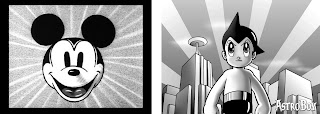
Post-war Japanese artist Osamu Tezuka, often referred to as the founding father of manga, saw what Disney was creating in the US. He was then inspired to create work of a similar character, but with a more distinct Japanese sensibility. Enter Astro Boy, as it came to be known in English, which cemented Tezuka's career. It's interesting to note how Astro Boy shares some visual similarities with Disney's work of that time.
 5. Robots & Technology
Tezuka at this point established the popular themes of robots and technology with Astro Boy. These themes would evolve and persist to this day, culminating in their own genres and sub-genres of anime and manga.
 6. The Anime Boom
The 1980s saw a boom in the anime industry in Japan, as well as a growing popularity stateside. With more money flowing, experimental film begin to be created. Among those, the cult classic Akira sets new standards. With Akira, we yet again see a resurfacing of the atomic bomb motif portrayed by recurring scenes of large scale destruction, intricately linked to the presence of technology.
 7. Serious Themes
Works such as Akira presented a seriousness which became more common during the period of the '80s and '90s. Further elaborated in the film Grave of the Fireflies, dealing with the issues of war, bombing, and destruction more directly became more accepted and applauded.
 8. Experimental Anime
Building on the trends of experimentation with the successful films of the 1980s, the '90s saw further exploration into uncharted waters in a serialized format. Neon Genesis Evangelion took those serious themes, and combined them with technological science fiction elements and motifs of robots and atomic bombs. It went one step further, by putting all these subjects under the umbrella of metaphysics.
 9. Serial Experiments: Lain
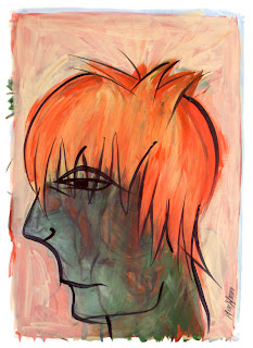
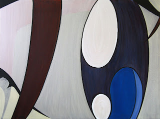
The period of experimentation culminated with the creation of Serial Experiments: Lain. The series built on multifaceted approach of including technology, but then advanced into a league of its own by becoming heavily cerebral. Lain embedded over a hundred references to literature, philosophy, history, and more. Its content is in my perception some of the most artistically created in the anime industry. So much so, that it served as the impetus for my shift toward this subject matter in my art. In 2000, I created my first anime styled painting, inspired by Lain (pictured above, right).
 10. Japanese Pop-art
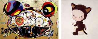
During the '90s, artists Takashi Murakami (pictured above, left) and Yoshitomo Nara (above, right) spearheaded a new movement of art based on Japanese popular culture. Using the visual vocabulary of anime and manga, this movement gained a lot of momentum in the 2000s. The international success of these artists has served as inspiration for other young artists the world over who have become fascinated by anime and manga as it flows across national and geographic boundaries.
 11. Powerful Means of Expression
It is interesting to me that I did not know about Murakami and his Superflat movement until several years after beginning to create work based on anime and manga. Personally, I found anime and manga imagery to be incredibly powerful as a means of artistic expression. Yet it would be difficult to deny the fact that knowing Murakami's work later on did not have any impact on my work. While I never tried to emulate his style consciously, I think it still exerted its influence on me in ways that I was not aware of.
 Currently, my work is beginning to move away from the style I have been developing over the last few years. I am now on the verge of a significant change, looking at what moved me all those years ago when I first began creating this type of art and then opening up to let in a multitude of other cultural influences finally make their presence known.
12. Conclusion
The most important thing in all of this, is to realize that while anime and manga may seem like a shallow consumer product at times it is in actuality a product of hundreds of years of history. Major cultural changes all contributed to the creation of a visual work that we are seeing today. This is true of any art form, but it is important to understand how this work has been influenced by the world we live in today and all that has come before us.
Anime & Manga Art: A Brief Introduction
Show Me Your Moves!

For about a year now, I have increasingly found that there seems to be less time for physical activity. Sure, that's an excuse in itself. But whatever the reason, it feels like it's harder to get some exercise. I have been busier, there's no doubt. Yet even in my leisure time I am more likely to blog or play games and watch anime and the like. Such is the life of the otaku.
When I started playing Guitar Hero and Frets on Fire, more and more I felt the desire to play DDR again. That's when I realized that this was the solution to my physical activity dilemma. I could be playing a game, brush up on my DDR skillz for whenever other opportunities would present themselves (i.e. Animazement) and get this body in better shape at the same time! A winning combination all around.
These days it doesn't take much to get dancin' DDR style. All you need is a pad, PS2-to-USB adapter, and StepMania. So you don't even have to buy the game anymore. Now, I wanted to save a little more money, and found an additional alternative for your dance pad option.
Normally, you'd want to get a good quality foam pad, which can cost about $90 or so. Buying an inexpensive soft pad is not a recommended choice. That is, unless you're up for a little DIY project. I found an excellent guide for modding your soft pad. My version is what you see pictured above, and it works very well. Though I did use slightly different materials at three parts of the guide.

For the vinyl runner, I bought one which had a rougher surface for better traction. Also, I did not use clear tape to adhere my pieces of the runner, but instead opted for a liquid vinyl epoxy. This allows for much better longevity, as tape would eventually discolor and start to come off, in addition to being more slippery under foot. Here's a breakdown of the total cost for this project...
- USB Adapter: $18
- Softpad: $20
- Foam Mats: $17
- Black Duct-Tape: $6.50
- Carpet Tape: $9
- Clear Vinyl (8 ft.): $8
- Vinyl Epoxy: $10
- Plywood: $0
- DIY Satisfaction: Priceless!
The advantage to a modded soft pad such as this is that it's actually stronger than a foam pad for the same price. Also, if the pad itself ever wears out, I can take it apart and buy another soft pad to replace it with. That's much cheaper than having to replace the entire pad.
My previous USB adapter that I was using for the guitar controller did not support dance pads, hence the additional cost there. So I had to spend a little extra money to get a proper adapter from Play-Asia. I went with the StepMania recommended choice, the Dual Shooter EMS USB2. Not only does it support pads, but also light guns, and it has two controller inputs. That means you can even do two pads or guitars for some multiplayer action.
Since the completion of this project, I've been playing quite a lot. It feels good to get up and move! Now I just need to keep on practicing so I can hit those harder songs. Wish me luck!
Fingers On Fire!
I too have contracted the highly contagious Guitar Hero Fever. After playing a whole bunch of it at Joe's place over Animazement weekend, I was hooked and had to get my fix. My only criticism of Guitar Hero was that there just weren't enough songs, and certainly not enough of the songs I would have liked to see in the game. That, as I understand now, is pretty much everyone's dilemma.
The solution to this problem is to grab Frets on Fire for PC (also available for Mac and Linux), which is a free open-source GH clone. The best part is that you can import all of your Guitar Hero I and II songs into it. Simply throw your game disc into a DVD drive, and let Frets on Fire churn away. Just be prepared for it to take a few hours.
I found FoF to be a great introduction to GH gameplay as well, allowing you to try out this type of experience for free. Initially, Frets on Fire is set up for the keyboard, which you must hold upside down and use much like a guitar. This is totally awesome in itself, and I will have none of your GH purists' complaints about it. However, if you want to maintain your GH skillz, there is an alternative.
If you don't have a guitar controller, you can certainly buy one to use with Frets on Fire. I opted to get the Nyko Frontman wireless guitar controller. After that, you just need a PS2 to USB converter, like the one offered by Radioshack. I can attest to this converter working very nicely with this setup, and it includes a driver CD for full support of PS2 peripherals. So yes, make sure you install those drivers.
Feel free to run the barebones FoF if you just want to try it out for a little bit. But if you want a better experience, I suggest delving into some of the mods that have been released for the game. The FoF community is basically in two camps. On one side, you have the people who still prefer the 1.1.x version of the game, running it combined with what's known as the RF-Mod. This combination is the most stable, and bug free, though it does lack some of the nice new features of the latest FoF release. Which brings us to the other side, being the players of the 1.2.x version (latest release), now significantly enhanced by Raph's GH-Mod. This version has a few stability issues, and may be a little slower on systems running dual-core processors (like mine). Even so, I prefer the latest version due to some nice added features and slightly different overall feel to the game. For big GH fans, this one may be easier to acclimate to.
After you have picked your version, and installed either the RF-Mod or GH-Mod (which is a must), you're all Ready to Rokk. Moreover, you can now get literally hundreds of additional songs to play around with. And if that's not enough for you, fire up the FoF editor to fret your own tunes. There may a bit of a learning curve, sure, but you're not going to get this opportunity with Guitar Hero.
Another great feature of Frets on Fire, in case you're still debating, is the World Charts. Every time you play a song, the score gets sent to the charts' server and recorded. You can then see how much you rock, or more likely suck, against everyone else playing FoF in the world. Look up your own name (or mine) to see a record of all your scores.
If you have problems getting anything to work, or just want to chat with other FoF players, you can always visit the forums. Just try, for the love of the guitar gods, not to sound like a complete noob. No forum likes that, and I'm sure you can figure some things out on your own if you just try.
Other than that, you should be set. So get out your guitar controller, go get that converter, and be prepared to play more songs than you can shake a... well, a guitar controller at. See you on the charts!
Guide to Creative Painting (Manga Version)
Some time ago I taught a painting workshop at the Yellowstone Art Museum using certain techniques to promote creativity and allow for a more "loose" rendering of the resulting image. The style is oriented towards an abstract expressionistic approach, but can be adjusted to fit other styles as well. I think it would be most beneficial if this lesson is made available to anyone who wishes to give it a try.
Moreover, this guide is intended for all levels of experience. If you have no experience in art you will hopefully find this just as beneficial and easy to follow as those who are more seasoned. Perhaps my most important recommendation is for you to set aside all of your preconceived ideas and knowledge of art. Doing so, as much as is possible, will make this experience more fulfilling than it would be otherwise.
Reference and Materials
The following materials are needed in order to proceed:
- charcoal or marker
- paper for drawing
- paint (acrylics are used in this guide)
- prepared painting surface (canvas, masonite, wood, etc.)
- brushes (including a long bristled liner brush)
I am using the above image as my reference, which was scanned from a Tokyopop sampler. The scan is from the manga Baby Birth by Haruhiko Mikimoto, and depicts the character Hizuru Oborozuki (Figure A).
Drawing Without Controlling
The first exercise involves creating some sketches of your reference object. However, if these were regular sketches, not only would that exclude many people from being able to perform this exercise, but it would also lack the desired effect. The sketches we'll be doing are referred to commonly as "blind drawings."
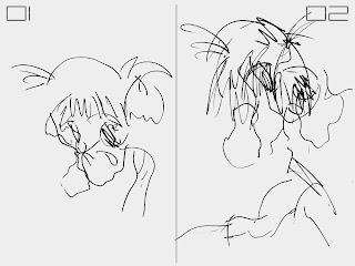
Here is an illustration of the difference between a loose sketch of the reference image (Figure B.02), and a blind sketch of that same image (Figure B.01). The idea of the blind drawing is to create it without looking down at your hand and the paper. You must not look down at your sketch until it is completed, keeping your reference in focus the whole time.
This may feel quite strange and uncomfortable at first, especially if you have never done this before. The reason is because you have very little control over the outcome of your drawing, which is exactly the intention of this exercise. By eliminating your perception of the creative process, it is also freed from what your mind would impose upon it. The mind often enforces its own rules upon what it perceives, and that is also why the drawing would loose some of its unhindered quality. In order to proceed, however, we need such an unhindered drawing.
I have three such blind drawings of Hizuru, each slightly different (Figure A and B). Yet they all share the same barely intelligible style. Feel free to create as many of these blind drawings as you wish, and go on to the next step when ready.
Since that next step involves moving into the painting portion of the process, this is a good time to prepare your space and materials. We need to choose one of our blind drawings and use it as the basis for our painting. Choose any of the drawings that you have created, but be aware that the end result of this exercise will not necessarily resemble that image.
Painting a Non-objective Foundation
Pick any color of paint to create a painted "sketch" of the blind drawing you have chosen on your prepared surface. Essentially, you can try to copy the drawing onto your canvas with the brush (Figure D.01). If you like, you may even try the "blind painting" method to further abstract the image on your canvas. This would function just as the blind drawing technique did earlier.
At this point, what is on your canvas is likely to look very abstract. This is where you begin to focus on the shapes and lines that you see, ignoring any possible "objects" you may wish to perceive. This in turn makes this part of the painting process "non-objective."
Following the example above (Figure D.02 and D.03), choose a color and begin to fill in some of the shapes that you see in your painting. Repeat this process again with a different color to until you have covered as much area as you wish. Keeping the paint diluted with water or medium allows you to see the underlying image of the initial line painting.
Next I would recommend choosing a new color and filling in the edges of your piece, which creates a sort of background. I am choosing a lighter blue to fill in around my piece composed of green and brown (Figure E.01). Let your painting dry after this step, in preparation for the next technique.
In order to create more depth, we are using a layering process not dissimilar from that used in digital image editing software. Your next color choice should be different from your previous choices. Keeping the paint slightly thinned, apply your new color around what could be the negative space in your image. Distinguishing between positive and negative in this case is very subjective due to the abstract nature of your painting.
You can see I am masking some of the elements previously visible (Figure E.02). Yet the slightly transparent nature of this new layer of paint allows you to see some of the image underneath it.
Let your painting dry again, and choose a new color once more. This time make your paint consistency very thin, in order to apply more of a glaze than a coat of paint. Use this mixture to coat the entire painting. I use blue to tint the painting with a blue hue (Figure E.03).
For the next section the painting needs to dry yet again. We will be changing direction also from our non-objective foundation. This is a good time to take a break in the process and reflect on the current image that you have created.
Painting an Objective Result
I recommend stepping back away from your painting at any time throughout the process to get a different perspective, but especially now. Look at what shapes you have created, and see if they remind of you anything. From here on out we will try to create an objective image from the abstract shapes that are contained on the canvas.
However, this is not entirely necessary. If you desire to rather create an abstract painting, simply continue with abstract shapes instead of the objective suggestions I am putting forth. Either direction is compatible with this guide.
My piece, partially due to being manga inspired, continues in that vein. I see the potential for a portrait style image. The combination of the shapes in my piece seem to suggest a profile view of a face. Deciding to continue with this imagery, you will notice that I am taking steps to achieve this (Figure F). So too, you may see shapes in your painting that remind you of an object. Focus on this and try to work towards shaping the painting into the object of your choosing.
My first decision towards this goal is layering more warm colors for the hair of my portrait (Figure F.02). These layers, using thinner paint, continue to generate depth in our piece and I would suggest continuing with this technique. Once satisfied with my new layers, I am choosing a lighter color than the background color already present to define my new shape.
Since the edges of your painting may not entirely match the object of your choice, I would recommend doing the same. Choose a color that is lighter than your background, and paint over the existing layers to define the shape of your object. It is not necessary to completely cover the underlying painting, because we are still trying to use the layering technique here.
Using a light color on a darker background serves two purposes. First, by allowing the underlying color to come through partially, we continue to add depth as with our other layers. Second, it creates richer lighting and texture. Be advised, however, that you may need to use additional paint for proper coverage. It is more difficult to lighten a surface than it is to darken it.
As we get into the final phases of this painting, I use thicker mixtures of color to actually cover up some of the work that was done earlier (Figure G). I use more light and warm tones to shape the hair of my portrait (Figure G.01), and a darker green wash to create a more uniform color of the face by negating that vibrant area of red (Figure G.02).
Some of this may seem strange in light of the care taken to create all the previous layers of the painting. You may choose to accentuate your previous steps by keeping your new paint layers thin enough to keep them more transparent. In my process I do so to varying degrees, and I feel that even if the colors and shapes don't always come through, the texture is richer than if I simply used one or two layers of flat color. Besides, I do not cover all of my previous layers in this case, thus retaining some of that transparency.
After my shapes have been defined I used one of my lighter colors, though not white, to give the piece a final wash (Figure G.03). Doing so lightens the whole painting, thereby softening some of the edges and high contrast areas. This is important because I wanted the face to be more intelligible, and it also prepares the image for my final techniques. If your piece is too dark, you may want to do multiple lighter washes, but remember to let the paint dry in between coats. If your painting is too light, then simply do a darker color wash, and don't be afraid to experiment.
The final techniques included in this guide are as follows. I want my character's hair to have a stronger tint of red, because I feel that it would provide a good contrast to his darker skin tone. I use an orange mix to shape his hair, giving it a little more volume, and of course those red highlights (Figure H.01). Similarly, you can choose a new color, possibly a contrasting one, to add a few final details that you may feel are missing.
The painting needs to be dry for the final touch. In the meantime, I suggest creating the paint mix that we will be using. The technique calls for a black, lower viscosity paint mix. I use parts of both water and acrylic medium with my black paint in order to achieve my desired thickness, which is only slightly thinner than that of latex house paint. You want the paint to flow easily off the brush.
The brush choice is also important for this step. I use a thin, long bristled liner brush, and that is just about ideal. The best brush for this purpose would be a round brush, between one to two inches in length (2-5 cm), and one eighth of an inch (3 mm) or less in width. Other brushes may be used as well, but it is more difficult to accomplish this step without the right type of brush.
The idea is to create contour lines with the black paint for a more graphic look. This is of course a stylistic choice that is particular to my own work, which you are free to modify or forgo entirely. However, if you do choose to add them, I think you will be pleased with the effect. It's important not to be too tight with your brush strokes when painting these lines. It is also important to know that the lines need not match up exactly with your image, nor should they. Almost like a print with misaligned registration, the natural and free-form look of the black lines is a stylistic choice that I am very fond of (Figure H.02).
This is the final version of the painting (Figure I). Naturally your painting will look quite different, unless of course you emulated my own steps in this guide exactly. Though I hope that you were able to open up your creative vault and find a method to bring forth its contents. My intention was to provide you with a guide that would not be difficult to follow, regardless of your skill level.
So on that note, I'd be glad to hear of your thoughts and suggestions about this article. Especially if you have followed the tutorial, I would be glad to hear of your experience. I would be even more glad to see your experience.
If you like this article, feel free to add your Digg and spread the word.
A Case Mod Christmas Story
Christmas went quite well I think. Even with our ever so limited budget. Because our wallets and bank accounts were so slim, I had to improvise on a few gifts this year. My mother has a cute little Pekingese named Betty, and I really wanted to get her a doggy sweater. The doggy boutique downtown had a great selection but they were charging prices a la your-first-born. So instead, Nikki volunteered her time and knitted an even cuter pink fluffy sweater for less than a cheap lunch. Yay!
Meanwhile, my mission was to give my sister a computer. She mentioned wanting one for her home office some months ago, and I thought that would be a perfect gift. Since I had enough spare parts I built her a machine suited well enough for her purpose. I commandeered an old HP, and decided to give it a little makeover. But, I wanted her PC to look new, even if it wasn't.
Supplies purchased for this mod came in under $10 for the spray paint, which was all it needed. I would have loved to add a window and cathode, but time was about as tight as money. As you may remember, the old HP cases that were somewhat ubiquitous at one point are not expecially attractive. I never really liked them even when they had just come out, let alone years later. So my vision, and challenge, was to create a cleaner look for the case and peripherals by painting the aged and yellowing plastic.

First step in this was to separate all of the case components from the metal chassis. There were actually a few more than I had anticipated. The plastic on these cases came in three colors, being gray, silver, and a transparent "charcoal" or something. The few minute clear pieces would remain unpainted as they were being used to refract LED lights.
After the separation anxiety, each part to be painted needed to be sanded down lightly for better texture, and cleaned from the dust. I ended up washing all the pieces and wiping them off. They were left alone to dry overnight before painting, just in case.
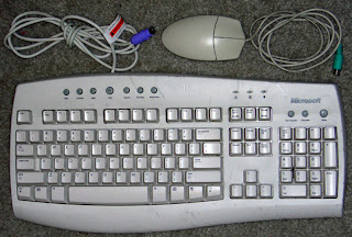
I pulled out an older Microsoft keyboard and a mouse to get painted as well. The keyboard needed it the most, due to some black marks that just wouldn't come off. I took off all the keys and dismantled the keyboard and mouse to prepare them for the painting process as well.
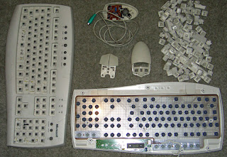
I was initially going to paint both the bottom and top parts of the mouse and the keyboard, but decided against it. Since the keys themselves had to remain unpainted, because I don't think my sister would appreciate not knowing which key is which, I chose to leave the bottom parts of both peripherals the original color. This would create a contrast in color that would match the difference between the keyboard keys and body.
The time for painting had arrived. I don't think I have mentioned that my color choice was white. But not the "ivory" white of old plastic mind you. Rather I chose a clean bright white in order to give the whole case a uniform and glossy finish. This would also lend the case a slight "Mac" flavor. Hey, I know that's uncharacteristic of me, but this old HP needed all the help in could get!

The mouse came out just fine and I was happy with the end result. Next up was the keyboard. After painting the cover, I noticed that all the keys were dirty (especially on the sides). Only one way to fix that. That's right, I got out my trusty cleaning spray and rag, and proceeded to clean each key individually.
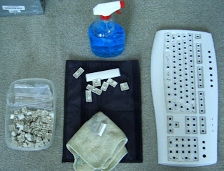
There it is. One key at a time. It was somewhat tedious to be sure, but it didn't actually take that long. Besides, it was worth it to have an old keyboard transform into something that looked newer, and even smelled new when it came out of the box on Christmas Eve!

Voila! One de-Microsoftized keyboard coming up. Next up were all the little (and big) pieces for the PC case. I made sure to do multiple thinner coats to avoid drips. The transparent components were painted on the back as well as the front to avoid any light coming through the back.
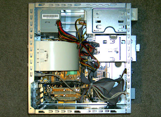
While all my case components were drying, I took that time to assemble the internal parts of the case. I fired it all up to make sure everything was still operational, and came upon a no-post problem that made me more than a little mad. As it turned out, while the parts were sitting in a closet for two months, the CPU for some reason decided to fry itself. I'll never understand how those things can happen. After hours and hours of switching out RAM, video cards, motherboards, and power supply units, I finally realized it was the processor. But at least I had found the problem. I switched it out, and bingo! By then the paint certainly had plenty of time to cure.

Here she is at last! All put together, and clad in white. I think it looks pretty good actually. And to match the new look of the case, I customized the Windows user interface too. I gave her the appropriate software package: Firefox, Thunderbird, Audacity, FreeMind, Ad-Aware, OpenOffice, TuneXP, etc. And with that out of the way I grabbed a few programs from WinCustomize and gave everything a new look.

Naming the rig after its recipient, the Tina PC deserved its own wallpaper, which I created using a photo of the case itself. I then changed the UI using WindowBlinds, and put up a boot screen up using Bootskin. Add to that a matching logon screen using LogonStudio and new cursors using CursorXP, and you've got yourself a newly restyled computer both inside and out.

I think all the elements matched up nicely. I'm fairly satisfied with the result given the available resources. With more time and money I would have gone further, naturally. But I think this is an example of how and old computer that would have been tossed out by many got a new look and a new purpose.
So go and grab that old junker and re-purpose it for file storage, a media PC, or give it away to someone who really needs a computer for the basics. There is always something you can do with an old PC, no matter how old it is. It's true. Just have fun with it, and remember to be nice to all your computers!
Update: I have received some nice comments on this article on Digg, and I must say I'm flattered. If you like this article, then by all means, head over to Digg and digg it!


