Shibuya Girls Pop at Giant Robot S.F.
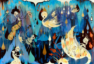
As a long time fan of Kaikai Kiki and it's female artists such as Chiho Aoshima, Aya Takano, Akane Koide and others, I was excited to see an exhibition of work by female contemporary Japanese artists come stateside. The cute theme is the common thread between all works in Shibuya Girls Pop: Real Japanese Kawaii, which opened with a reception on Saturday, February 5. As it turns out, Sugarpill Cosmetics was doing free kawaii makeovers in the gallery space, hence the appropriately attired contingent.
The show represents twelve female artists all part of the Shibuya Girls Pop project, which initially started in Shibuya as a distribution of free post-cards to woman in the city in order to spread a positive message. Artists from the collective that are in the show include the following...
Nana Aoyama, Eimi, Sayaka Iwashimizu, Marrontic, Hiroshi Mori, NICO, Keiko Ogawa, Ra'yka, Shinjuko, Yuki Takahashi, Kayo Tamaishi, and TAMMY.As a new Tokyo-based collective, Shibuya Girls Pop collaborated with Giant Robot to exhibit Real Japanese Kawaii for the first time in America. Yet in all honesty, none of the work blew me away. While a small number of pieces felt interesting, the show as a whole was not brilliant. The most interesting art pieces for me personally were those by Eimi, Kayo Tamaishi, and Yuki Takahashi. Both demonstrated technical skill, interesting use of color and good composition. The fact that the artists were not there in person certainly didn't help to drum up interest for the work itself either. As one person at the opening familair with GR put it, "it's just filler" until the next show goes up.
"Although it might be only a romantic, naive illusion, I think it would be great if I could show a universal 'Kawaii' that will not fade with the times or yield to media manipulation or labeling. I would like to propose 'Kawaii' that will survive even after the present global 'Kawaii bubble.'"
Artists 2 Love
There Is Another

While doing some gallery research I came a cross a piece which obviously looked rather familiar. Since I had done a similar painting not too long ago for [peripheral/interface], I noticed it right away. Artist Susan Crile put together an entire series called "Abu Graib: Abuse of Power."
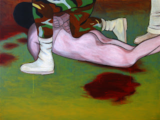
It comes as no surprise that her piece is so similar to mine, as the photograph which both of these paintings are based on was popularized by the media and therefore became a logical choice as a recognizable icon. Interesting to note is also that there are about four years of time separating her piece and mine. She created hers back in 2005 when the events were still fresh in the public mind, while I returned to the issue somewhat late. Nevertheless, Abu Graib recently came back into the media on account of president Obama's efforts.
My desire to post this was in part fueled by being surprised there was not more artwork based on the Abu Graib tortures. Granted, there is some. Yet I would have thought there would be more. Perhaps I just haven't come across much of it.
New Paintings
At last my new paintings from the Caffé Phoenix show are up. You can find them over at michalwisniowski.com in the painting section. Also up are a whole slew of my graphic design images there in the digital section of the site. Just put it all up this morning!
The Lain Factor
On account of my recent post about Lain, I feel inclined to talk a little about how it has influenced my art. As I think I may have mentioned before somewhere, Lain was what inspired me to begin painting anime. The reason for this is that Lain is a very powerful work, and I was deeply moved by its characters, story, and art. At the time it was also the first anime I had seen with such a high level of maturity, which made me realize just how powerful of a medium anime can be.
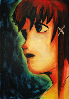
The first anime style painting I made was a portrait of Lain, in very vivid colors of course. I can't be sure as to my exact intentions then, and this was about six years ago, but I believe my choice to use more intense colors to make her "glow" reflected just how strongly I felt about Lain then.
Little did I know, how this first painting would change the focus of my artistic endeavors. Now, I'm not sure how long it took me before I would attempt Akogare after this. I suspect it was a while. Though I did work on another doujinshi piece entitled Mai only several months after the Lain piece. In that school year, as this was during my art studies at RMC, I may have created somewhere around four finished paintings in this style.
Sometime in 2001 when I first painted Lain, I created another portrait of her. In all honesty I don't recall which came first, but this was a charcoal drawing of the same character. It may have been a practice run to see if I could even do this style, but given my obsession with Lain it's difficult to be sure.
The point I guess I'm trying to make is twofold. First, Lain is an incredible anime which inspired me to do what I do with my art. I think we got that one covered though. Second, Yoshitoshi Abe has been my most important influence artistically from that moment on. This is not to discount my primary influences prior to Lain, as they still show up in parts of my work. Yet I think it takes a lot to change an artist's focus so dramatically, and that change I credit to Abe.
Someday, I intend to meet this man and tell this to him personally. Someday when I'm in Japan, as I intend to be there in the not so distant future.
Eye After Abe
A few days ago I finished another painting. This one follows my series of "eye paintings." In part it was inspired by my recent re-watching of Serial Experiments: Lain. Lain was the series which compelled me to begin painting anime in the first place, and I wanted to do another study of Abe's style. This result is a closer examination of some stylistic attributes in the style of Yoshitoshi Abe.
I have made some changes of course, but his work is rather distinctly different than that of other mangaka and anime artists. I wouldn't say that I am completely satisfied with the painting, but I would also not call this piece unsatisfactory. All in all, it turned out well. It just isn't as "perfect" as I would like it to be. Next time perhaps.
Two New Works
Recently I have completed two new paintings. Both are a slight departure from my continuing obsession fascination with anime eyes. Greater emphasis was placed on color in these works as well.
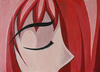
This first piece was done from a sketch I had finished some time ago. I thought it interesting to try and see how much effectiveness of the anime eye can be retained when the eye is closed. The result I find fairly successful, and a little surprising even. Keeping to a monochromatic palette helps to retain focus on the closed eye.
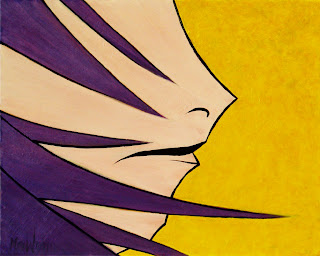
The second piece was begun last year, and supposedly finished. However, I had used the wrong brush to add the black lines at the end, and the whole thing didn't turn out very well. It sat around for a while in it's state of semi-completeness until I could figure out what to do about it. I decided to simply go back a few steps and repaint the individual areas of color. This also gave me a chance to adjust the colors a little more. I ended up doing a lot of layers on this, and putting in additional texture in the yellow area. Finally, I was able to redo the lines proper and tweak the mouth.
I suppose this is the first official "mouth painting" in what will turn out to be more when I'm not working on the "eye paintings." Chances are I'll be doing both series simultaneous at some point though.
Akogare RC2
This has been in the works for some time. I actually spent quite a bit longer on this than I do on many of my paintings. This is in part due to the size of the piece, but also because I approached it a little differently. Akogare was one of the first anime inspired pieces I ever did. In fact, I think it was the second actual anime painting, done back in 2004. That was a long time ago.
The initial version of this was an attempt to design an original character, since my first painting was based on Lain. The character itself was not bad, but the execution of it in this painting was not so very good. I still hand the painting sitting around since that day, and a few months ago was stricken by the urge to make this right. To be fair, some elements in this piece weren't bad, and there is a spontaneity to the background which does not come easily anymore.
I first sketched out the character concept anew and more accurately, after which I began to paint over the original face. Nevertheless, my goal was to keep the same expression and feeling that was intended when I painted it the first time around. I took my time with the renewal of Akogare in order to make sure that I did the piece justice. Because, even though I wasn't that fond of the end result, the feelings contained in the piece were and are still important to me.
With the character finished, I had a hard time figuring out what to do with the background. I knew I wanted to keep some of that powerful brushwork, but needed to tie it in with the new character somehow. After much deliberation, I decided to simply accentuate what was already there, and relate the background to the character using color.
In the end, I believe I'm mostly satisfied with the result. It is certainly much stronger than the previous version, and thus Akogare is born anew. Better, faster, stronger, as release candidate 2. Or something like that.
Curly Brace: The Painting

Some time ago I created a vector of Curly Brace from Cave Story (Doukutsu Monogatari). What came before that, however, was a sketch I did of that same image. I had intended to make a larger piece from that sketch for a while and at one point I had begun working on painting it. I think I got about half way done with this painting before setting it aside.
I can't remember exactly what was happening at the time, but I must have gotten busy and lost a little of my motivation to finish this painting. So it sat there for a good few months unfinished, hanging out on the easel and looking at me expectantly. Thankfully, things have started to simmer down in terms of everything going on work-wise, and I find myself painting more and with renewed determination.
Last week I finally thought better of keeping her in suspense like that and decided to finish the piece. So here I present you with "Curly Brace." The canvas is 20 in. by 24 in. She's a bit of a symphony in blues, but that's because I wanted to keep to the original colors present in the game's character portrait (link).
Rated G
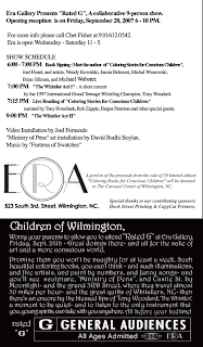
On Friday, September 22, we will hold the opening for our new show at ERA Gallery titled "Rated G." As noted on the card above, it is a collaborative show. The items on display can be grouped into three categories, which each artist created a piece for. Our first project was to design quilts, which were then taken to a local quilt-maker for construction. The second group is a collection of paintings which each artist created a paint-by-numbers pattern for. Multiple copies of the patterns will be available and displayed next to each painting. The final element, which was also the largest undertaking, is a children's coloring book.
Local author Joel Finsel contributed five short stories, and five artists illustrated each of those stories. The name of my story is "Ruby's Slippers," and I had previously mentioned doing illustrations for this a little while back. Needless to say, getting this book made has been no small task, but it is finally coming to fruition. Each artist's illustrations will be displayed individually in the gallery as well.
Of course, as is the custom at ERA, plenty of additional elements will be present the night of the opening, making it a bit of a inter-disciplinary event. Among those will be performances by the 1997 International Grand Teenage Whistling Champion, Tony Woodard. In addition, each story from the book will be read to the attending audience by special guests.
The painting for which I created the paint-by-numbers pattern is With Open Eyes. I felt it lent itself well to this endeavor, and I hope that it will complement my other offerings such as the quilt. Now, I still haven't seen the quilt itself, and I must admit I am a bit anxious as to how it's all going to turn out. At any rate, this is shaping up to be quite an affair.
Is Art a Luxury?

Recently I’ve begun to ponder the meaning of art, and whether or not it is necessary or simply a luxury for me. For someone who claims to be an artist, I do surprisingly little art, and do not consider it a viable source of income. Michal sees art as a necessity, and as such, we argued over the true meaning of art one night. Seeing as I had so little backup for my argument, and never finished my reasoning for this belief, I'd like to take the time to write a little bit of my history with art and why I would say something like this.
When Michal and I first met, he hung a student show containing nothing but my art. I believe I just turned 18. I was a very quiet person back then, and very content to remain so. During that first year of college, I painted like a madwoman. Some of my best works were made in that time. In fact, the painting which sparked Michal's first interest in me was made in that time. Here she is shown above, very small compared to the original, which is the largest painting I've ever made. (~5'x6') I still have mixed feelings about her, and about all my art. Sometimes I think about giving it up, along with all my pieces, donated to some charity or other.
I remember writing for one of my many, many college courses a paper on the philosophy of art. Not to bore you with mundane movements of recent past, art has been a long process over thirty thousand years old. That's how old they say the paintings in the French caves are. Who am I to debate carbon dating? Supposedly, everything in art revolves in a cycle, doomed to revolve around the fads and fashions as each era passes, and each generation of people adopts these elements as their own. To say my art is unique among thousands, where thousands of people have used the same instruments as I, and employ similar techniques seems absurd. In my paper, I attempted to describe what it meant to be an artist and the philosophy of creation. In essence, after many events, I now question if my passion for art is the same as it was five years ago, or ten, or fifteen. Ever since I was a young girl, perhaps as young as seven, I told myself that I would be an artist. Now that I am older, I doubt my reasoning for all my actions thus far in my life. "What the hell am I doing in North Carolina," is a frequent question that I ask myself. "What is next?"
While some may debate these vague thoughts of mine, I know that my pursuit of art is a luxury at this time and place. To be a successful artist takes great effort and communication, and these are things that I haven't done. This is not to say that I won't ever make the attempt, but so far, the time is rapidly ticking away, and the artist is lazy.
Infidelity of Itsuki

After the opening at ERA for The Vice Squad, I received many wonderful compliments on my painting entitled Infidelity of Tomoe. I became somewhat attached to her, though I knew that I shouldn't. It had been so long since I had sold a painting, which is why it came as a bit of a surprise to me. Just five days or so after the opening Tomoe was already sold, and on her way to her new home in some strangers possession.
It felt strange not to know the person who bought my piece, and even though I was happy about the sale, I was a little sad to know that I would not ever see that painting again. In a way, I go through this every time I sell a painting. It almost makes me not want to get rid of them, but that would be silly. I will have to work on my "attachments."
Because of the Fourth Friday Art Walk, I needed to have a piece in the show to continue my representation in the Gallery. I was thus tasked with creating a new painting on fairly short notice. And so, the sequel to my first painting was born.
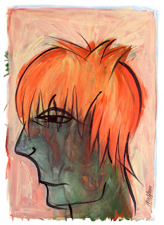
I present to you Infidelity of Itsuki. Inspired by the character Itsuki Kisaragi from RahXephon. Though I admit that it is not often I paint male faces, I thought this character to be a good match, still fitting the same vice, and the design of his face lent itself quite well to what I wanted to achieve. But I will leave the interpretations to the viewer.
You can also see this painting up on Minitokyo here. Your feedback is, as always, welcome and appreciated.
Update: I have been able to take a better photo of this piece now, so the image has been updated both here and on MT. The new image is sharper, and the colors are more accurate to the original, so it's of higher quality overall.
Infidelity of Tomoe

For ERA's "The Vice Squad" exhibition I ended up drawing infidelity as my vice. As previously mentioned, I wanted to work with the broadness of its definition with my image.
The inspiration came from Rurouni Kenshin, and the character of Tomoe in particular. For the uninitiated, she is the widow of a nobleman who was killed by Kenshin. She then searches for Kenshin with the intention of revenge. Yet after staying staying with him under false pretense, Tomoe begins to fall in love with Kenshin. She wrestles with these emotions, the guilt of betraying her dead husband's memory on one hand, and the love she has found in knowing the true heart of Kenshin on the other hand.
In the end I hope that I managed to create an image which can have many different meanings, and will allow for as much variety in its interpretation as the people who will view it. You can also see it on Minitokyo.
The Vice Squad

On May 18th, a new show's opening up at ERA, downtown Wilmington. The focus of the show, as you might guess, is the vices. Each artist randomly drew one of the vices on the list to create a piece specifically for this show.
My vice turned out to be "infidelity." I initially assumed the common definition and went with that. But at some point I decided to look it up on Wikipedia (link), and found that the definition was much broader than I had realized. Apparently, infidelity is a "breach of faith" in any type of relationship, personal or professional. Knowing this helped with my design, and now I feel that my painting can be interpreted in as many ways as the definition itself.
I also feel privileged to be in this show with other very prominent local artists. Many of them I know personally, and names like Dan Brawley, Sullivan Dunn, Bonnie England, Chet Fisher, and Dixon Stetler have continually come up in the art community here.
Most who will read this I know don't live close enough to see the show, but I will post my finished painting and some additional photos of the opening here after the fact. For those who do live close by, I hope to see you there. I think this show is going to be very interesting indeed.
"I Am 8-Bit" Exhibition

The I Am 8-Bit Exhibition opened about a week ago at Gallery 1988 in LA. You can see a video of the opening over at Vinyl Pulse, and catch more details about the incredibly successful opening night. To see photos of every single piece in the show, check out the complete photo set on the I Am 8-Bit website.
Though perhaps not quite as prestigious as MoMA, Gallery 1988 had people lined up to see this work all night. You can't argue with success, which only shows that they too are doing us a great service in supporting artwork influenced by gaming culture.
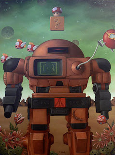
I must admit that I felt a slight tinge of disappointment at the overwhelming amount of Mario and Pac-Man art. Is there nothing else but Nintendo and Namco to choose from? Well, maybe I'll just have to prove them wrong. There were additional themes naturally, but images of Mario and his cohorts dominated the walls as you can see in the photo set mentioned above.
Nevertheless, this exhibition has undoubtedly generated a lot of good publicity for video game art. Maybe next year we can expect a little more diversity. A broader subject range can only serve us well, and there is certainly enough material to draw from.
Elevating Comic Art
The exhibition entitled Comic Abstraction opened at MoMA on March 4, and it is good to see this area of art getting more recognition. Naturally, when an institution such as this does anything, the message tends to resound unto the far reaches of the art world. So it is only natural that Art News would run an article on the show. Written by Peter Plagens under the name What's So Funny About Abstraction, it's helping to elevate artwork created under the influence of comics.
Plagens focuses on making a distinction between the tragic and comic traditions in abstract painting, serving up early modern styles as an example of the former. The latter, and more recent, continues to demonstrate its suitability for abstraction as it gains momentum. In the first paragraph of his article we are reminded that "the comics are a lot older than abstraction," with the first being published some two hundred and five years ago.
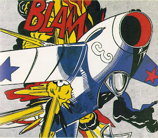
Comic abstraction in itself is not quite that new either. We have Lichtenstein's work as an early example of that, and that was over forty years ago unless there is something prior to it I'm not aware of. So why is it that a stigma is still being associated with paintings in this tradition? And why is it that the existence of such a separation seems to be stronger in the western world?
These are some of the questions raised by the MoMA exhibition. The online description for it reiterates that "in the United States and Europe comics have stood at the nexus of the high-low debate, while in Japan manga and anime have never been differentiated from art." Meanwhile, Plagens also declares that "comics and abstract painting share a common root." Being the effort to exclude certain details, while exaggerating others, in order to disclose the work's purpose.
It comes as no surprise to me that the lines between high art and the low-brow work of the "less elevated" are beginning to blur. To me, comic art and derivatives thereof represent all that is good and vibrant in art, without being diffused by the elitism of art establishments. How can artists not be influenced by the tsunami of work from Japan? How can we not be inspired by that which we see in ever greater numbers?
 My own effort in this veign of painting, Tears
also on Minitokyo (link)
There is only one answer to those questions for me. The simple truth is that I, for one, can't. My only hope is that the momentum gained from MoMA's possible acceptance of what seems contrary to its nature, and Plagens' consequent written word, will retain its virility. I know that the chances are slim. Yet maybe this will bring about some change in the perception of the good people of the world. Maybe even generate more acceptance of this movement, if I can even call it that, among galleries.
Why not. Let's call it a movement. Now to come up with a name. A name that is all inclusive, and one which will transcend some cultural differences. I'll have to think about this one.
Guide to Creative Painting (Manga Version)
Some time ago I taught a painting workshop at the Yellowstone Art Museum using certain techniques to promote creativity and allow for a more "loose" rendering of the resulting image. The style is oriented towards an abstract expressionistic approach, but can be adjusted to fit other styles as well. I think it would be most beneficial if this lesson is made available to anyone who wishes to give it a try.
Moreover, this guide is intended for all levels of experience. If you have no experience in art you will hopefully find this just as beneficial and easy to follow as those who are more seasoned. Perhaps my most important recommendation is for you to set aside all of your preconceived ideas and knowledge of art. Doing so, as much as is possible, will make this experience more fulfilling than it would be otherwise.
Reference and Materials
The following materials are needed in order to proceed:
- charcoal or marker
- paper for drawing
- paint (acrylics are used in this guide)
- prepared painting surface (canvas, masonite, wood, etc.)
- brushes (including a long bristled liner brush)
I am using the above image as my reference, which was scanned from a Tokyopop sampler. The scan is from the manga Baby Birth by Haruhiko Mikimoto, and depicts the character Hizuru Oborozuki (Figure A).
Drawing Without Controlling
The first exercise involves creating some sketches of your reference object. However, if these were regular sketches, not only would that exclude many people from being able to perform this exercise, but it would also lack the desired effect. The sketches we'll be doing are referred to commonly as "blind drawings."
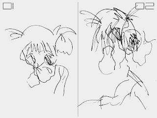
Here is an illustration of the difference between a loose sketch of the reference image (Figure B.02), and a blind sketch of that same image (Figure B.01). The idea of the blind drawing is to create it without looking down at your hand and the paper. You must not look down at your sketch until it is completed, keeping your reference in focus the whole time.
This may feel quite strange and uncomfortable at first, especially if you have never done this before. The reason is because you have very little control over the outcome of your drawing, which is exactly the intention of this exercise. By eliminating your perception of the creative process, it is also freed from what your mind would impose upon it. The mind often enforces its own rules upon what it perceives, and that is also why the drawing would loose some of its unhindered quality. In order to proceed, however, we need such an unhindered drawing.
I have three such blind drawings of Hizuru, each slightly different (Figure A and B). Yet they all share the same barely intelligible style. Feel free to create as many of these blind drawings as you wish, and go on to the next step when ready.
Since that next step involves moving into the painting portion of the process, this is a good time to prepare your space and materials. We need to choose one of our blind drawings and use it as the basis for our painting. Choose any of the drawings that you have created, but be aware that the end result of this exercise will not necessarily resemble that image.
Painting a Non-objective Foundation
Pick any color of paint to create a painted "sketch" of the blind drawing you have chosen on your prepared surface. Essentially, you can try to copy the drawing onto your canvas with the brush (Figure D.01). If you like, you may even try the "blind painting" method to further abstract the image on your canvas. This would function just as the blind drawing technique did earlier.
At this point, what is on your canvas is likely to look very abstract. This is where you begin to focus on the shapes and lines that you see, ignoring any possible "objects" you may wish to perceive. This in turn makes this part of the painting process "non-objective."
Following the example above (Figure D.02 and D.03), choose a color and begin to fill in some of the shapes that you see in your painting. Repeat this process again with a different color to until you have covered as much area as you wish. Keeping the paint diluted with water or medium allows you to see the underlying image of the initial line painting.
Next I would recommend choosing a new color and filling in the edges of your piece, which creates a sort of background. I am choosing a lighter blue to fill in around my piece composed of green and brown (Figure E.01). Let your painting dry after this step, in preparation for the next technique.
In order to create more depth, we are using a layering process not dissimilar from that used in digital image editing software. Your next color choice should be different from your previous choices. Keeping the paint slightly thinned, apply your new color around what could be the negative space in your image. Distinguishing between positive and negative in this case is very subjective due to the abstract nature of your painting.
You can see I am masking some of the elements previously visible (Figure E.02). Yet the slightly transparent nature of this new layer of paint allows you to see some of the image underneath it.
Let your painting dry again, and choose a new color once more. This time make your paint consistency very thin, in order to apply more of a glaze than a coat of paint. Use this mixture to coat the entire painting. I use blue to tint the painting with a blue hue (Figure E.03).
For the next section the painting needs to dry yet again. We will be changing direction also from our non-objective foundation. This is a good time to take a break in the process and reflect on the current image that you have created.
Painting an Objective Result
I recommend stepping back away from your painting at any time throughout the process to get a different perspective, but especially now. Look at what shapes you have created, and see if they remind of you anything. From here on out we will try to create an objective image from the abstract shapes that are contained on the canvas.
However, this is not entirely necessary. If you desire to rather create an abstract painting, simply continue with abstract shapes instead of the objective suggestions I am putting forth. Either direction is compatible with this guide.
My piece, partially due to being manga inspired, continues in that vein. I see the potential for a portrait style image. The combination of the shapes in my piece seem to suggest a profile view of a face. Deciding to continue with this imagery, you will notice that I am taking steps to achieve this (Figure F). So too, you may see shapes in your painting that remind you of an object. Focus on this and try to work towards shaping the painting into the object of your choosing.
My first decision towards this goal is layering more warm colors for the hair of my portrait (Figure F.02). These layers, using thinner paint, continue to generate depth in our piece and I would suggest continuing with this technique. Once satisfied with my new layers, I am choosing a lighter color than the background color already present to define my new shape.
Since the edges of your painting may not entirely match the object of your choice, I would recommend doing the same. Choose a color that is lighter than your background, and paint over the existing layers to define the shape of your object. It is not necessary to completely cover the underlying painting, because we are still trying to use the layering technique here.
Using a light color on a darker background serves two purposes. First, by allowing the underlying color to come through partially, we continue to add depth as with our other layers. Second, it creates richer lighting and texture. Be advised, however, that you may need to use additional paint for proper coverage. It is more difficult to lighten a surface than it is to darken it.
As we get into the final phases of this painting, I use thicker mixtures of color to actually cover up some of the work that was done earlier (Figure G). I use more light and warm tones to shape the hair of my portrait (Figure G.01), and a darker green wash to create a more uniform color of the face by negating that vibrant area of red (Figure G.02).
Some of this may seem strange in light of the care taken to create all the previous layers of the painting. You may choose to accentuate your previous steps by keeping your new paint layers thin enough to keep them more transparent. In my process I do so to varying degrees, and I feel that even if the colors and shapes don't always come through, the texture is richer than if I simply used one or two layers of flat color. Besides, I do not cover all of my previous layers in this case, thus retaining some of that transparency.
After my shapes have been defined I used one of my lighter colors, though not white, to give the piece a final wash (Figure G.03). Doing so lightens the whole painting, thereby softening some of the edges and high contrast areas. This is important because I wanted the face to be more intelligible, and it also prepares the image for my final techniques. If your piece is too dark, you may want to do multiple lighter washes, but remember to let the paint dry in between coats. If your painting is too light, then simply do a darker color wash, and don't be afraid to experiment.
The final techniques included in this guide are as follows. I want my character's hair to have a stronger tint of red, because I feel that it would provide a good contrast to his darker skin tone. I use an orange mix to shape his hair, giving it a little more volume, and of course those red highlights (Figure H.01). Similarly, you can choose a new color, possibly a contrasting one, to add a few final details that you may feel are missing.
The painting needs to be dry for the final touch. In the meantime, I suggest creating the paint mix that we will be using. The technique calls for a black, lower viscosity paint mix. I use parts of both water and acrylic medium with my black paint in order to achieve my desired thickness, which is only slightly thinner than that of latex house paint. You want the paint to flow easily off the brush.
The brush choice is also important for this step. I use a thin, long bristled liner brush, and that is just about ideal. The best brush for this purpose would be a round brush, between one to two inches in length (2-5 cm), and one eighth of an inch (3 mm) or less in width. Other brushes may be used as well, but it is more difficult to accomplish this step without the right type of brush.
The idea is to create contour lines with the black paint for a more graphic look. This is of course a stylistic choice that is particular to my own work, which you are free to modify or forgo entirely. However, if you do choose to add them, I think you will be pleased with the effect. It's important not to be too tight with your brush strokes when painting these lines. It is also important to know that the lines need not match up exactly with your image, nor should they. Almost like a print with misaligned registration, the natural and free-form look of the black lines is a stylistic choice that I am very fond of (Figure H.02).
This is the final version of the painting (Figure I). Naturally your painting will look quite different, unless of course you emulated my own steps in this guide exactly. Though I hope that you were able to open up your creative vault and find a method to bring forth its contents. My intention was to provide you with a guide that would not be difficult to follow, regardless of your skill level.
So on that note, I'd be glad to hear of your thoughts and suggestions about this article. Especially if you have followed the tutorial, I would be glad to hear of your experience. I would be even more glad to see your experience.
If you like this article, feel free to add your Digg and spread the word.
With Open Eyes
Not too long afterwards I managed to get it hung at a local Port City Java cafe, about two blocks away from where we live. I did forget to photograph it before hanging it up there and it wasn't until just this week that I remembered to go down there and take the picture. So here it is, With Open Eyes, acrylic on canvas. It's 16 in. x 20 in., so not as big as some of my previous work.
I've promptly uploaded it on Minitokyo and a new local art community website I joined up recently called This Is Viral. Ning. Check out the Minitokyo page here, or at This Is Viral. Ning here. I strongly recommend viewing the larger version for better detail.
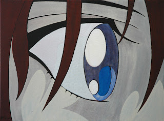
As I wrote on MT, my intention as of late is to bring more focus to individual parts of the anime face in an effort to discover what makes them so compelling to me. By focus closely on one element at a time I hope to discover how it can generate its effects alone, without necessarily being part of the entire face.
Granted that this piece is a slight step back in terms of focus, especially if you compare it to Tears. However, the focus on the eyes in this piece still shows their effectiveness to me. Rest assured, more images are to follow in this exploration.


